Building Trust in Invygo's Subscription
Lead Product Designer • Invygo, Dubai (Series A)
Designing for expats across the UAE and KSA meant validating English and Arabic experiences in parallel. The clearest signal, however, wasn’t in the UI. It was in the App Store.
Learn more about corporate cards

The Signals We Couldn’t Ignore
When I started working on Invygo’s iOS app, the product technically worked. Users could book cars. Subscriptions activated. Payments went through. But something else was happening quietly in parallel — and it wasn’t happening inside the app. It was happening on the App Store.
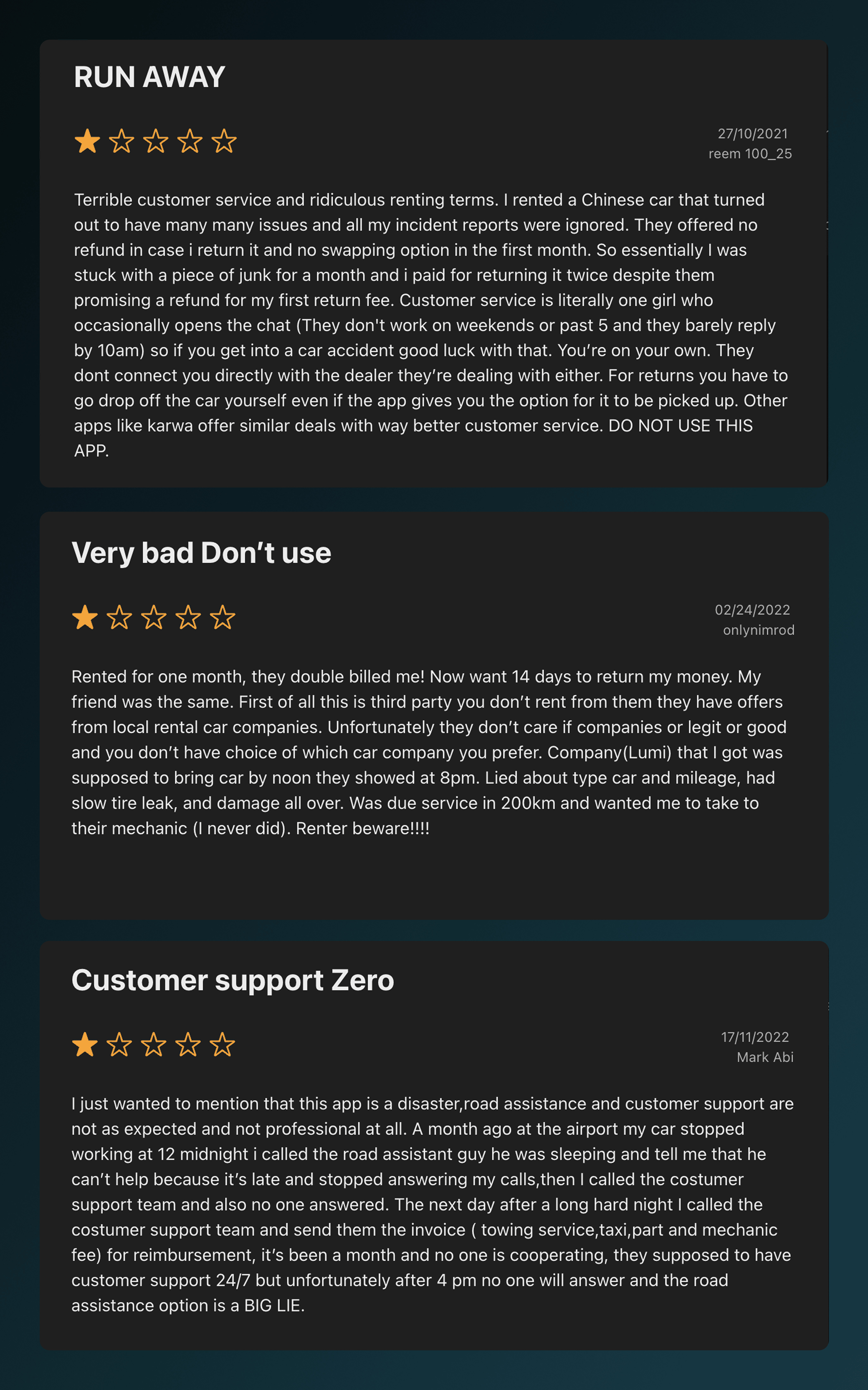
Scrolling through App Store reviews from 2022, I wasn’t just seeing complaints—I was seeing warnings. Long, detailed reviews written to protect the next user. Users weren’t confused while tapping buttons. They were confused about what they had agreed to—often after the fact. A clarity issue.
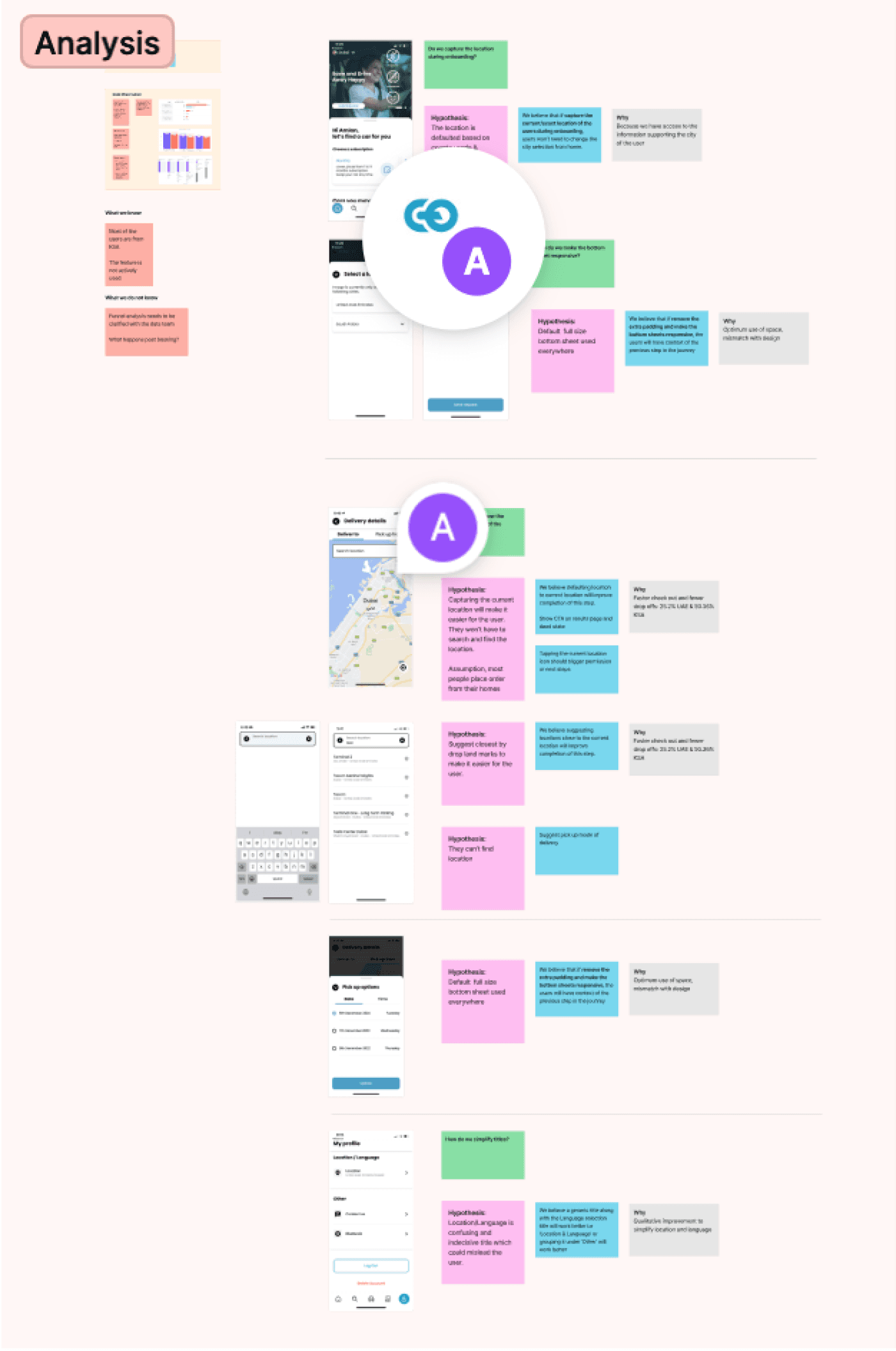
Indentifying Gaps In the Product
Our CRO tests and app store reviews on the first-time journey all pointed to the same issue: the app was internally consistent, but externally confusing. Users didn't understand the value proposition and rental conditions. We began identifying the signals.
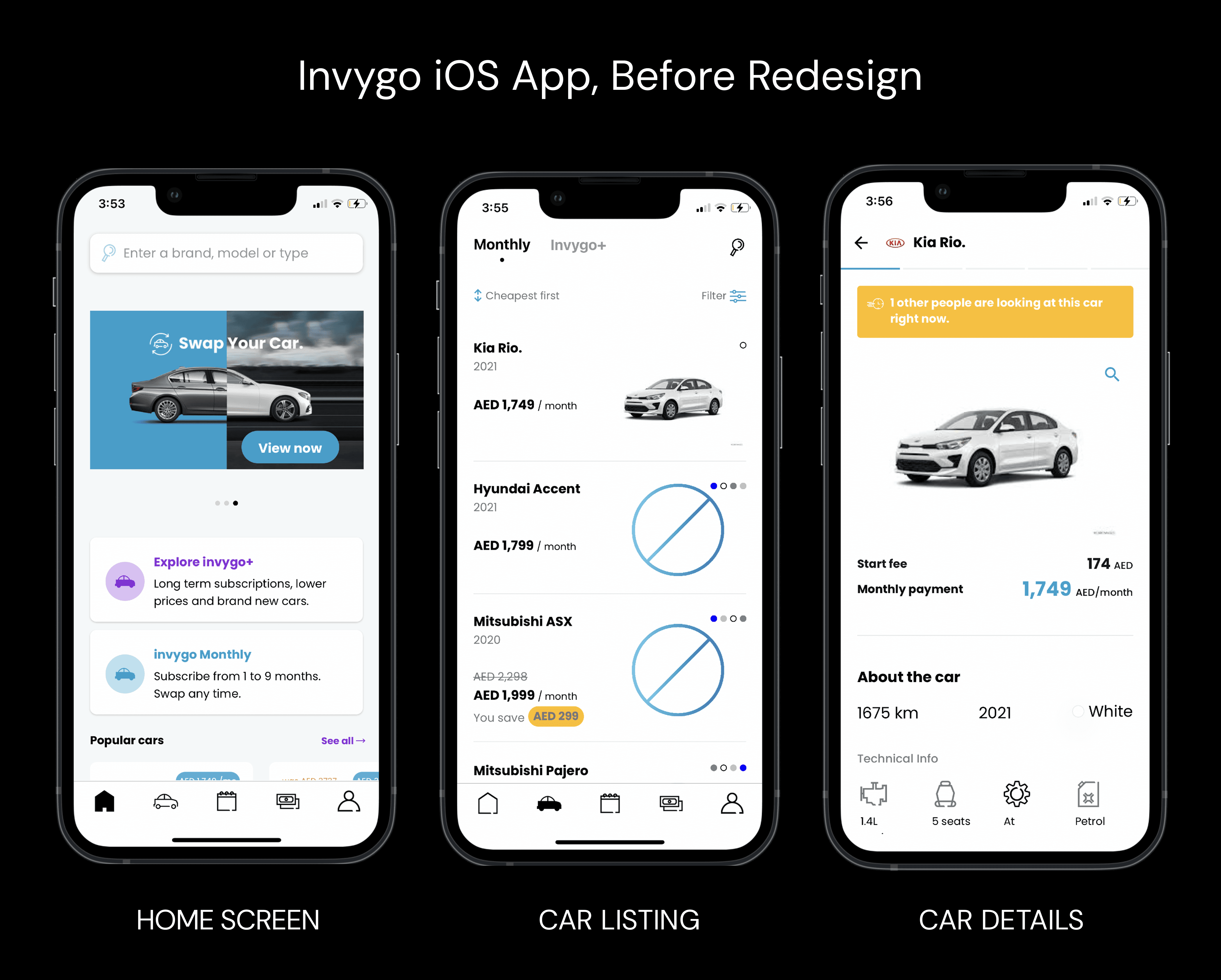
On paper, Invygo’s product made sense: a flexible alternative to traditional car rentals in a market where ownership isn’t always practical.
The iOS experience, however, assumed users already understood:
How subscriptions differ from rentals
What kind of commitment they were making
Where platform responsibility ends and dealer responsibility begins
For expats new to the region, often navigating in Arabic—those assumptions were costly. The app wasn’t deceptive. It was optimistic about what users already knew what to do. It was optimized for returning users who already had a subscription, not for those trying it for the first time.
Designing for Confidence
At this point, the problem reframed itself. Users weren’t failing to complete flows. They were failing to feel confident enough to commit.
That shifted the design goal entirely. The question stopped being “How do we simplify this screen?” and became:
What does the user need to understand right now to move forward without doubt?
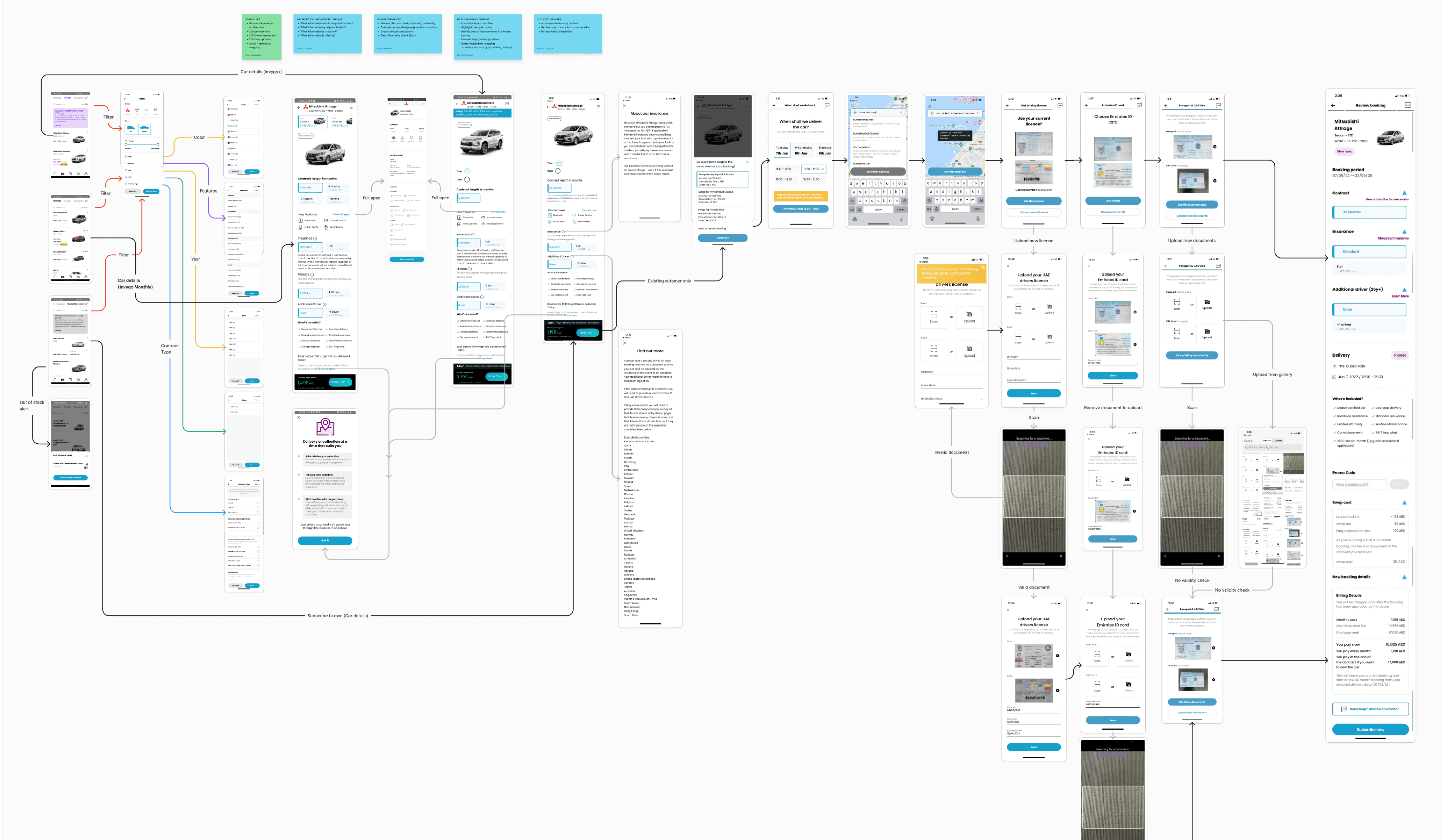
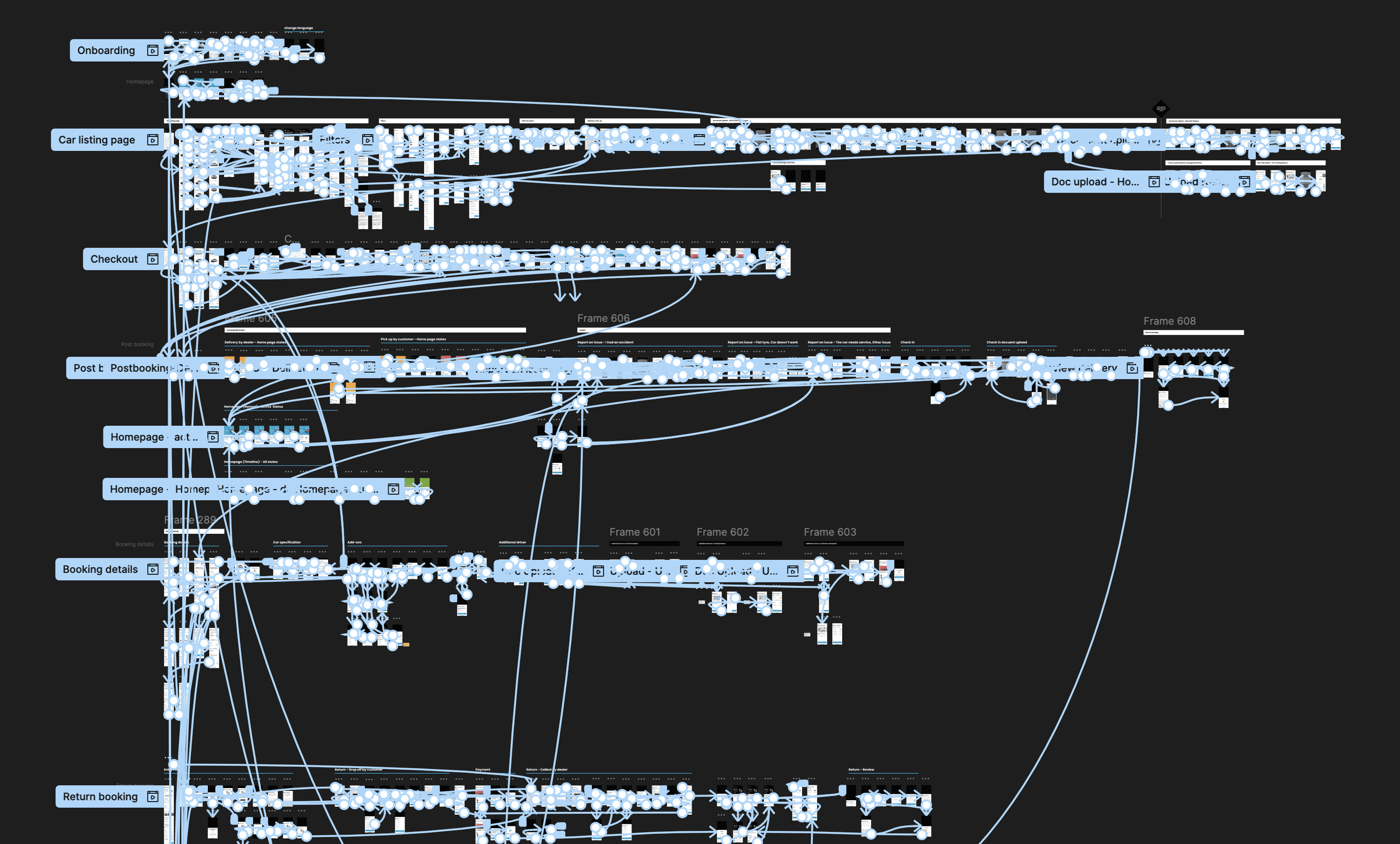
Solving this once wasn’t enough. The same clarity issues surfaced across screens, states, and flows. That’s when it became clear the solution couldn’t live only at the screen level.
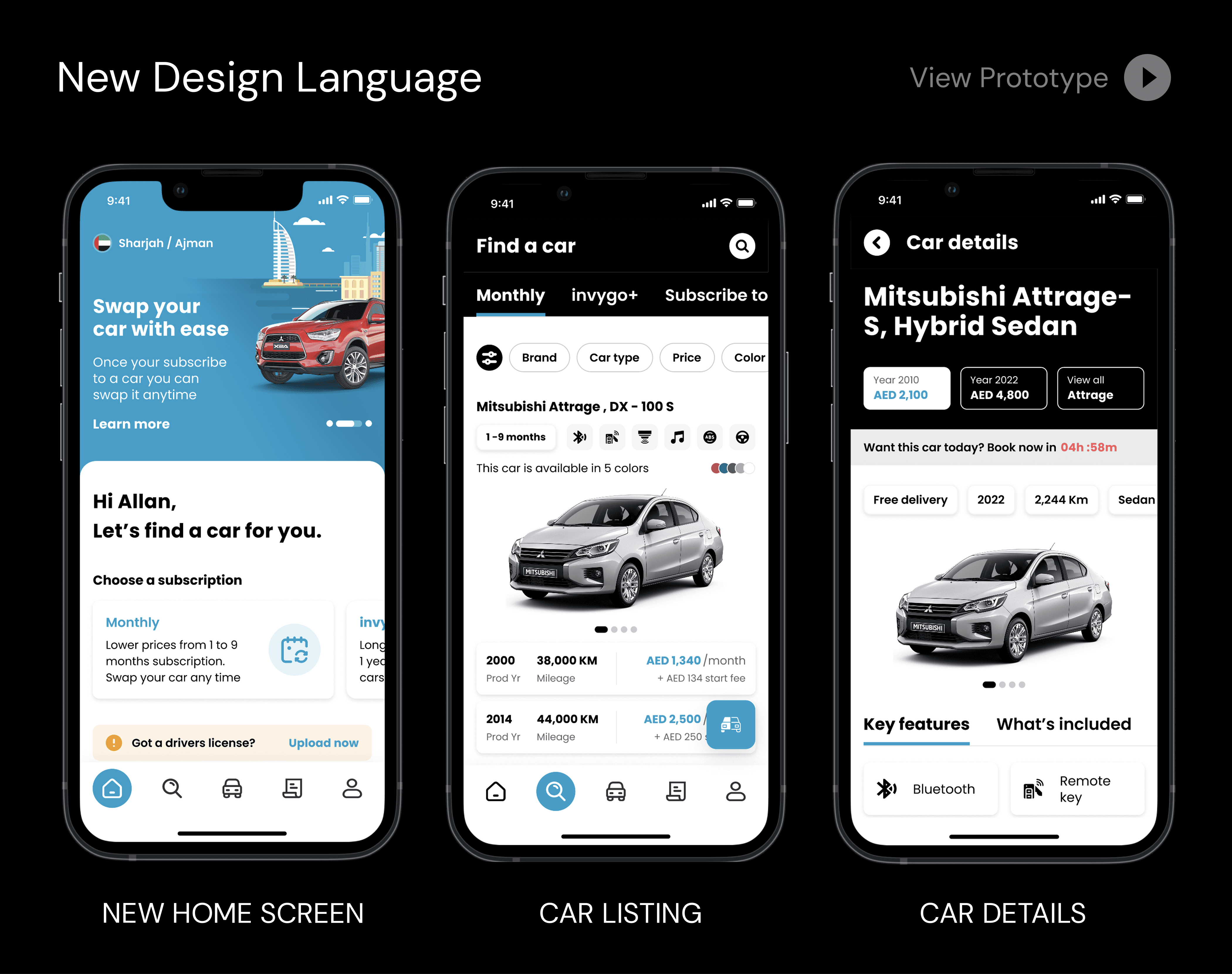
Encoding it Into a System
A redesigned iOS first-time booking and subscription journey
UX improvements grounded in real customer pain points
A scalable mobile design system that emerged organically from the work
Accessibility-forward components usable across languages and markets
This was not a cosmetic redesign.
It was a foundational UX reset.
Testing RTL Accessibility with AI
Accessibility and RTL weren’t layered on afterward—they shaped the work. Accessibility acted as a forcing function:
Stronger contrast for dense financial information
Clear hierarchy over decorative styling
Predictable interactions that reduced cognitive load
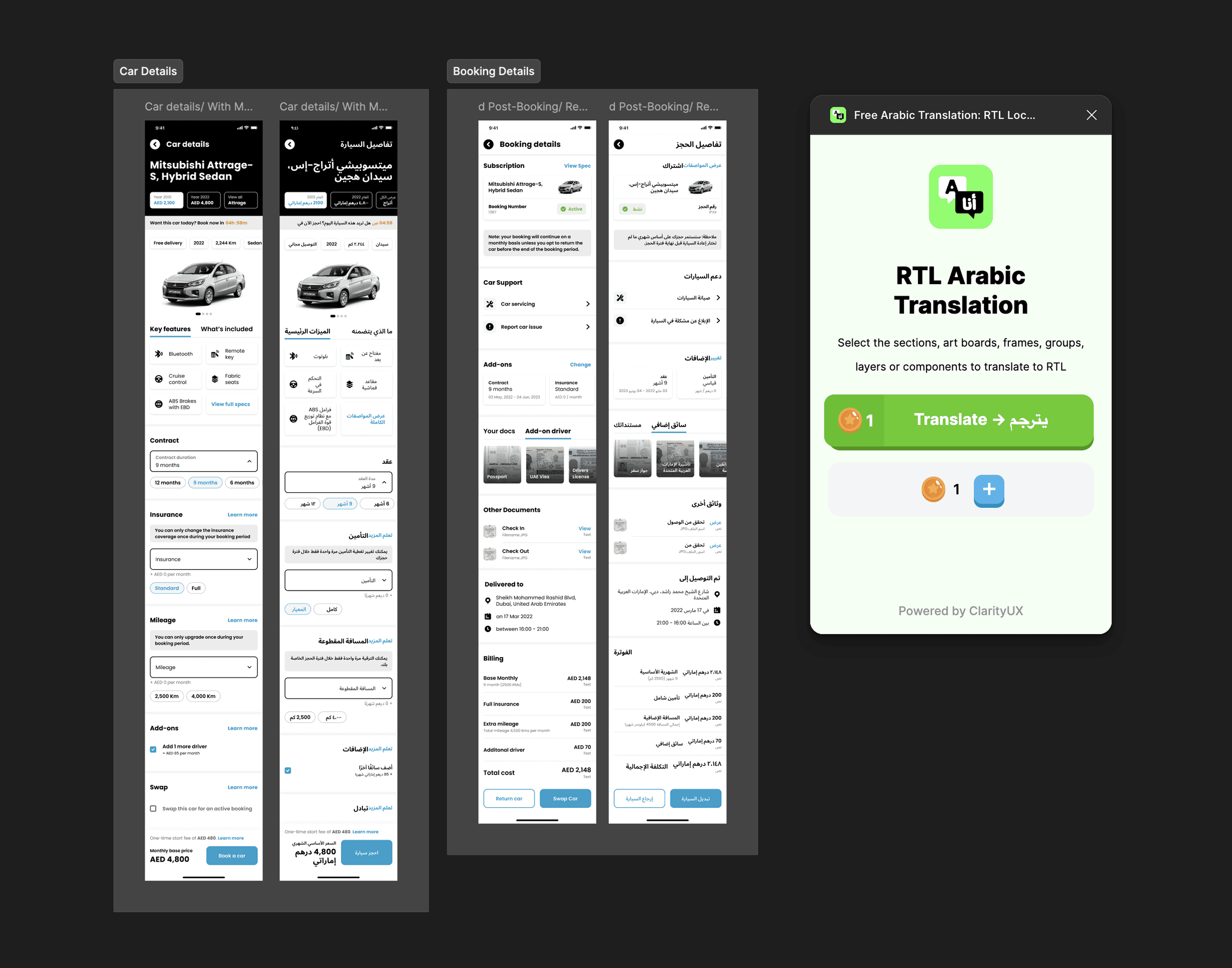
RTL design amplified these issues. Using my RTL translator plugin during design reviews made problems immediately visible—layouts that felt acceptable in English often broke down in Arabic. Designing with RTL from the start exposed structural weaknesses early and led to more resilient solutions.
This wasn’t about mirroring layouts. It was about building components that worked direction-agnostically.
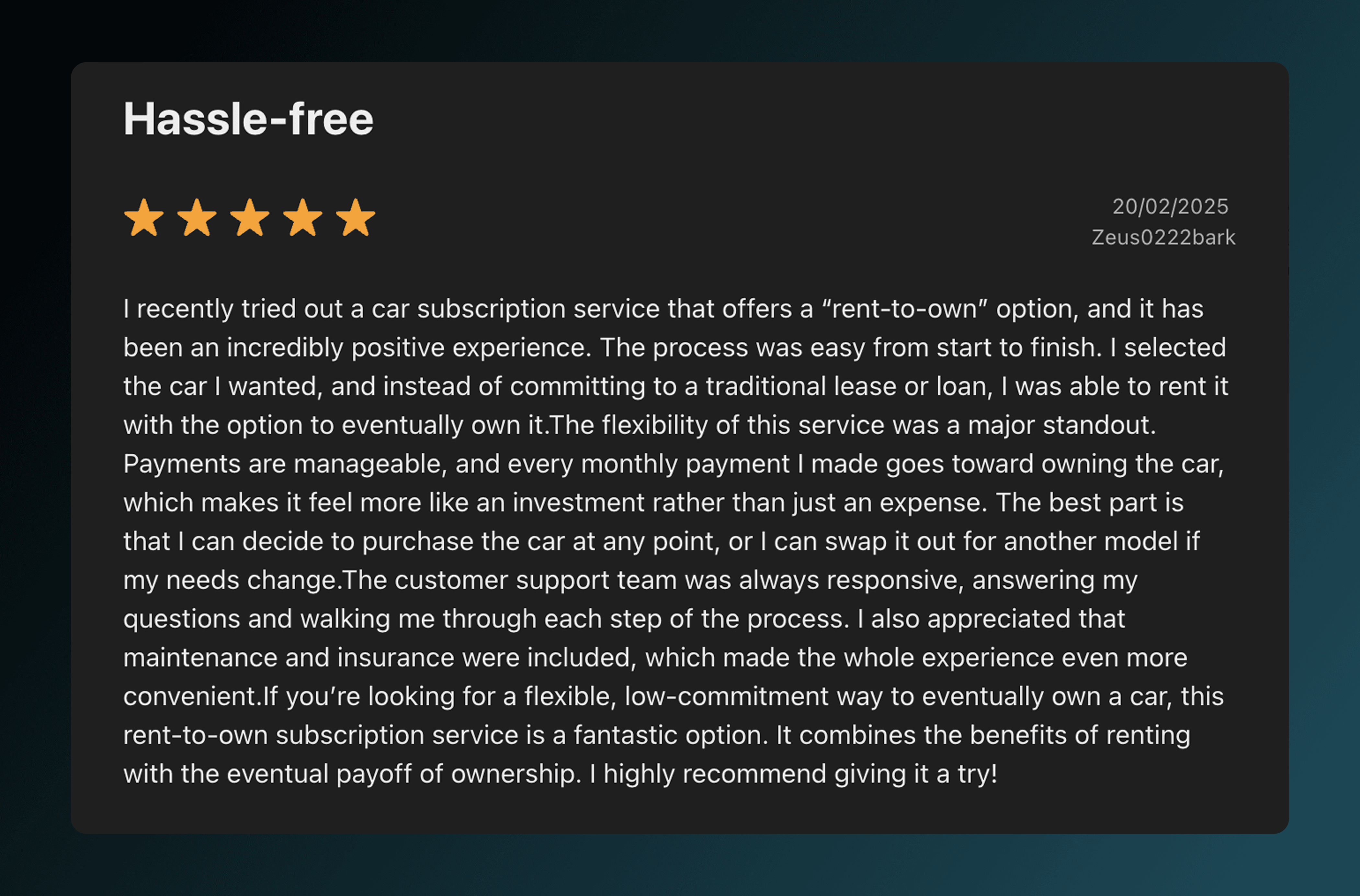
A Small Win
Not every outcome shows up as a metric.
After the redesign began rolling out, a different kind of signal appeared—quiet, but meaningful. Among the critical reviews and warnings, there were now reviews that sounded… calmer.