
Reducing Friction in EHR
Product Design • Practo (Series C)
Practo Ray supports clinics across APAC and the Middle East. It manages appointments, electronic health records, billing, inventory, and reporting — used daily by over 50K doctors, receptionists, and administrators.
Learn more about corporate cards
The Structural Problem
The legacy interface surfaced everything at once — dense tables, competing visual weights, and fragmented actions with little prioritization. Information was available, but not immediately legible. The system required scanning when it should have enabled deciding.
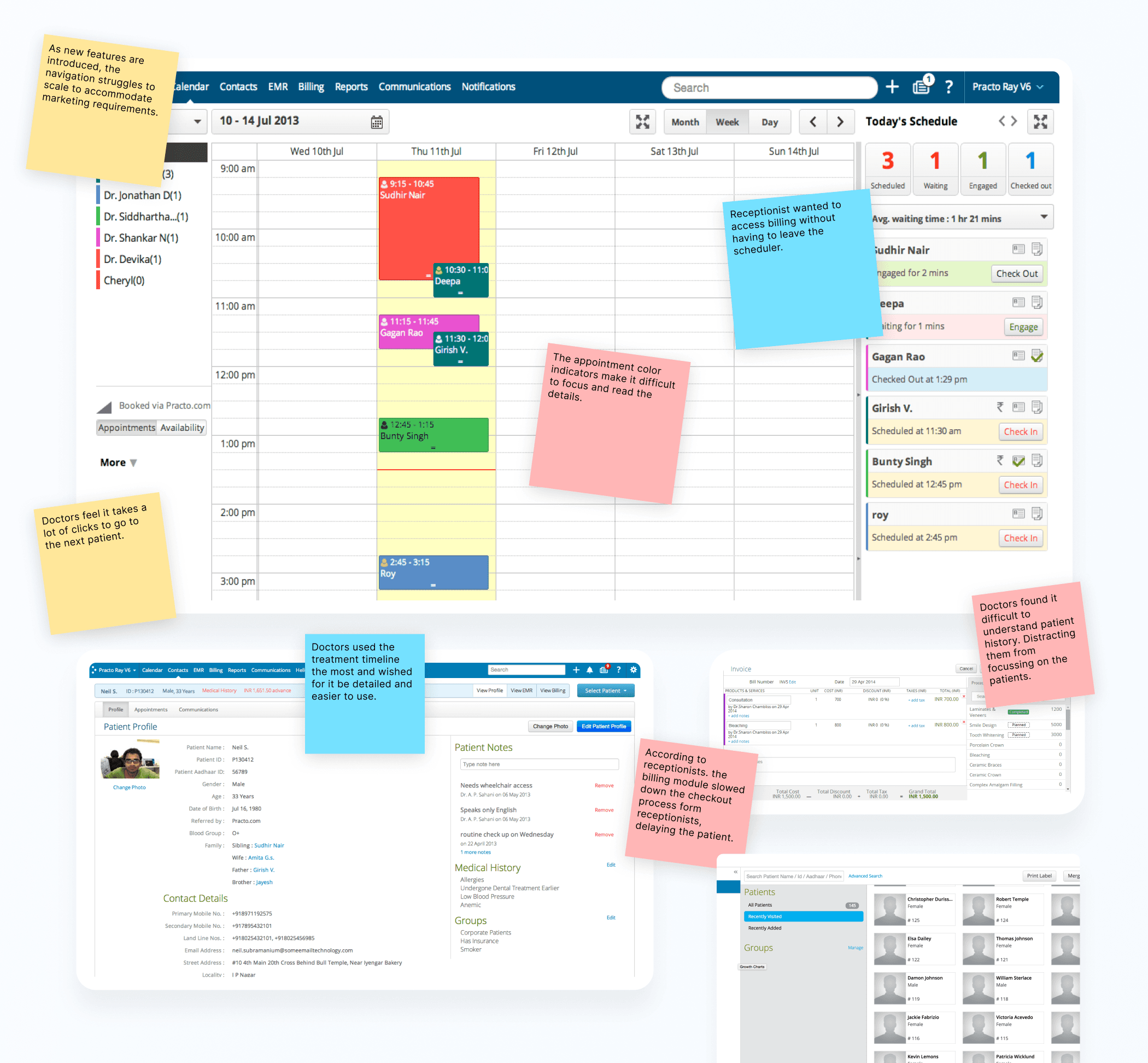
As features expanded, navigation deepened and modules evolved independently. Users relied on training instead of clarity. In healthcare, hesitation is costly. The challenge wasn’t visual refinement — it was restructuring decision architecture.
Mapping Operational Loops
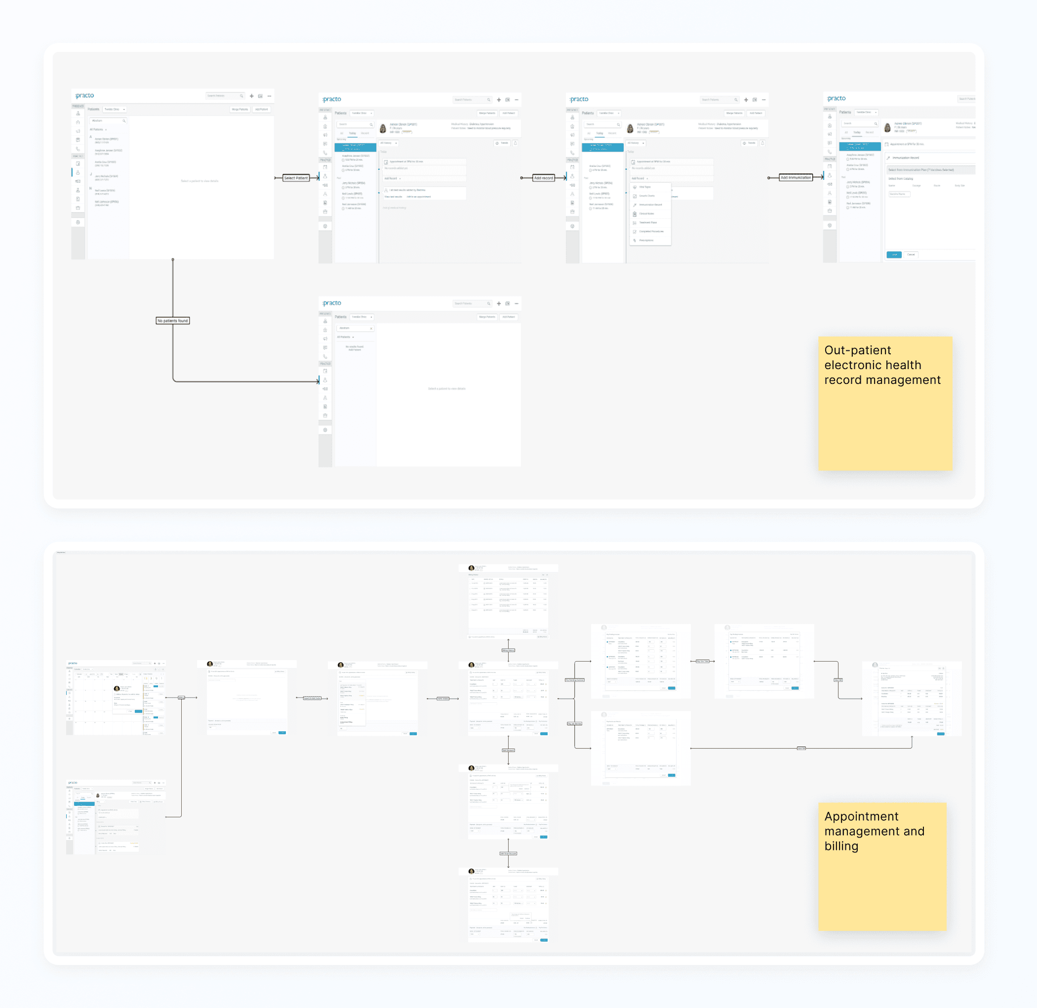
Before redesigning the interface, I mapped how clinics actually operate — from consultation to prescription, peak-hour scheduling, billing cycles, and administrative review. These weren’t isolated screens to improve. They were continuous operational workflows that the system needed to support seamlessly.
Reworking Navigation & Heirarchy
Once the workflows were defined, the navigation had to align with them. The focus shifted to flattening depth, reducing competing primary actions, and grouping related functions by context.
The goal wasn’t fewer features — it was a clearer structure that made decisions easier.
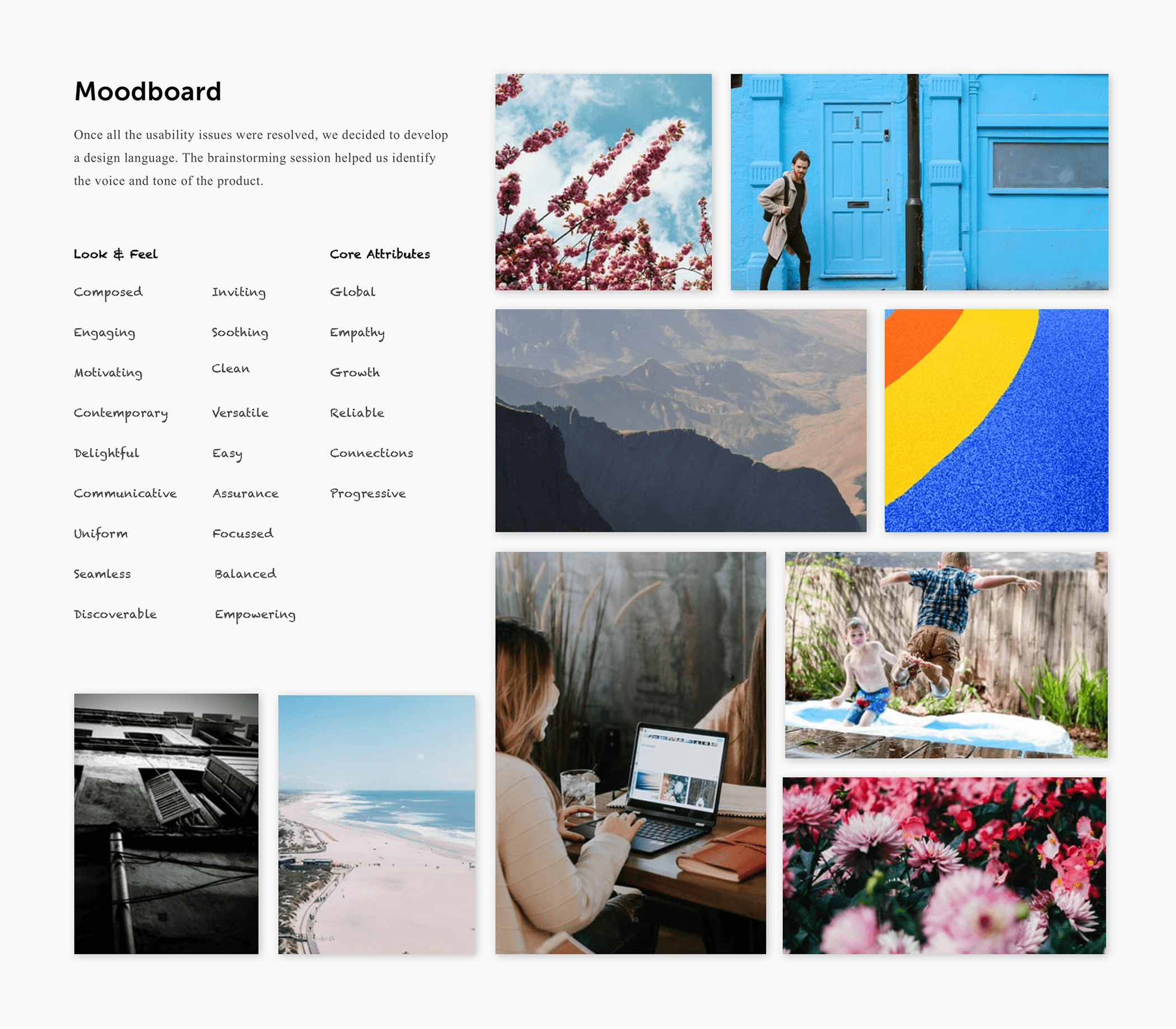
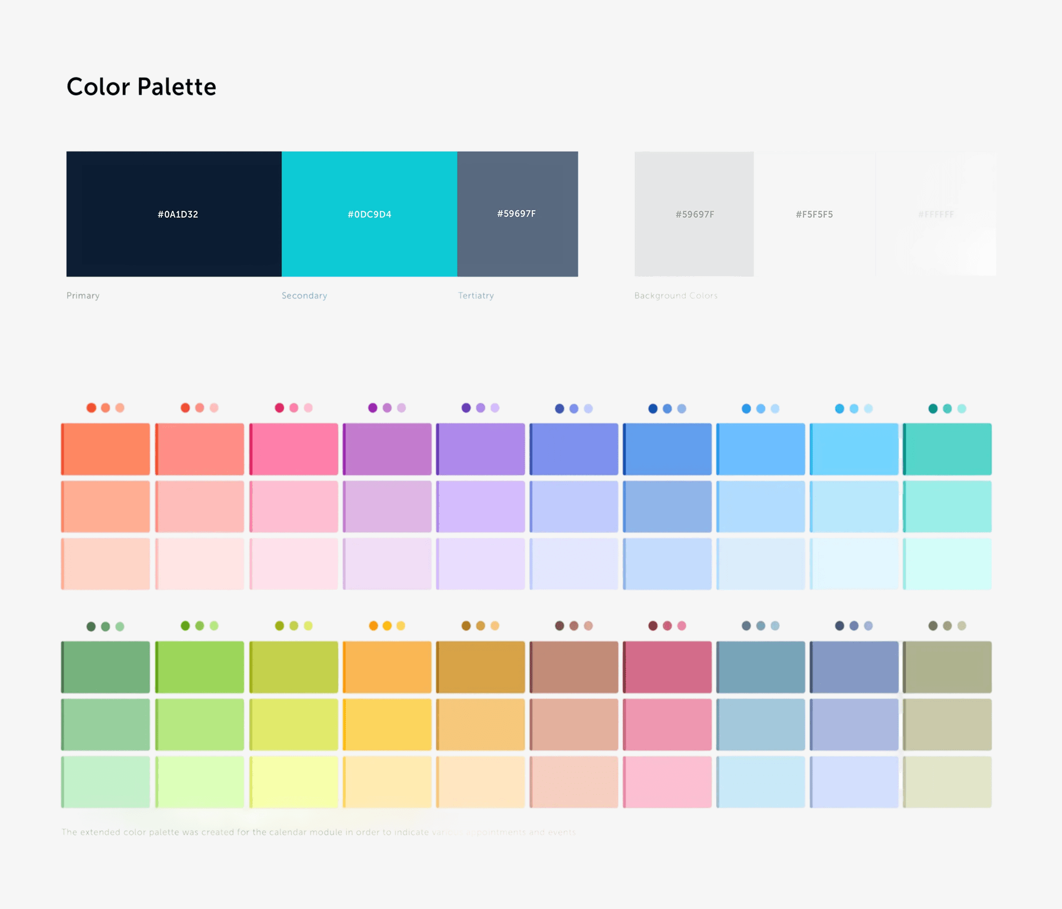
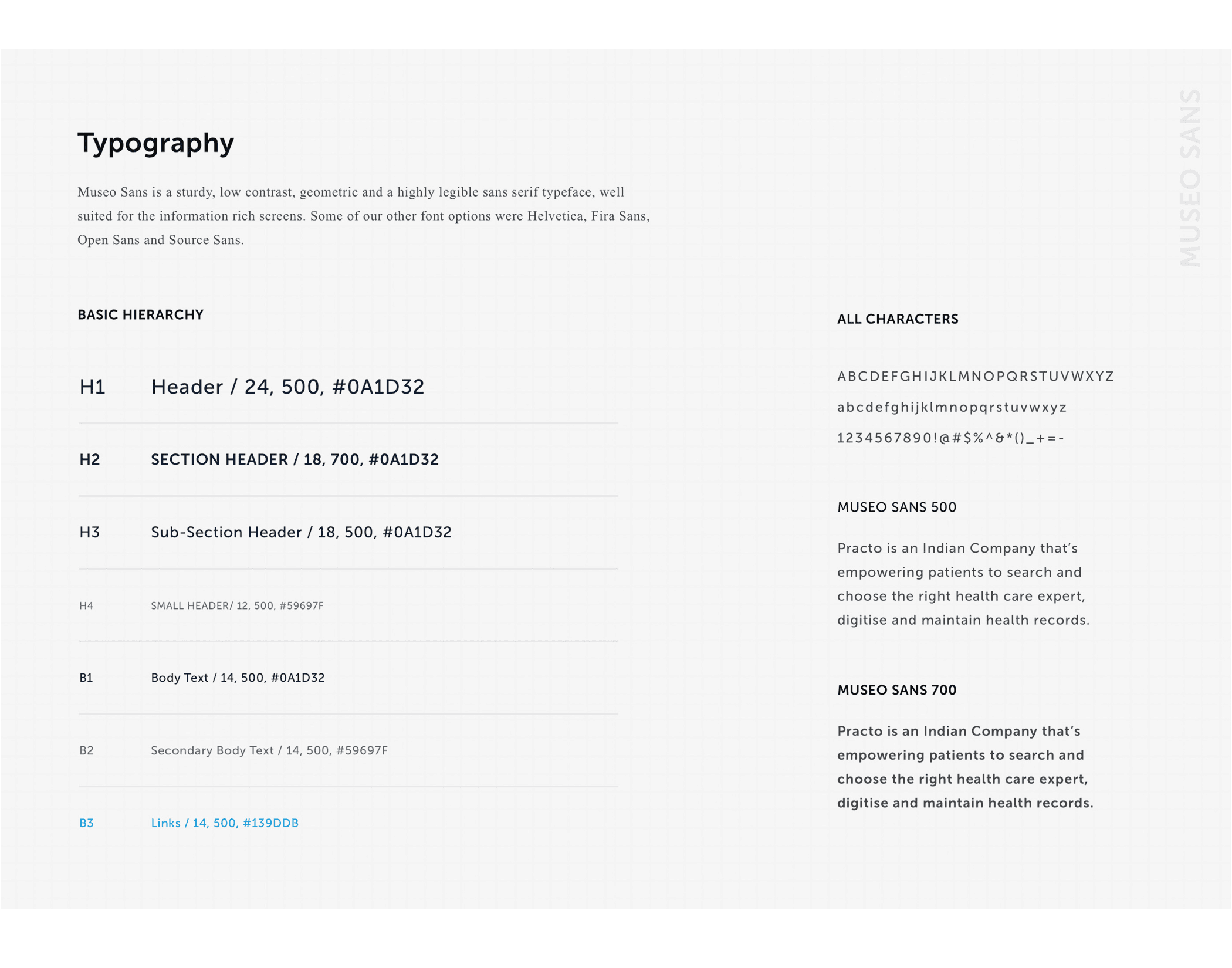
Defining the voice and tone
With structure in place, we defined the system’s voice — through mood boards, a restrained color palette, and typography designed for sustained use, not decoration.
Designing Across Roles
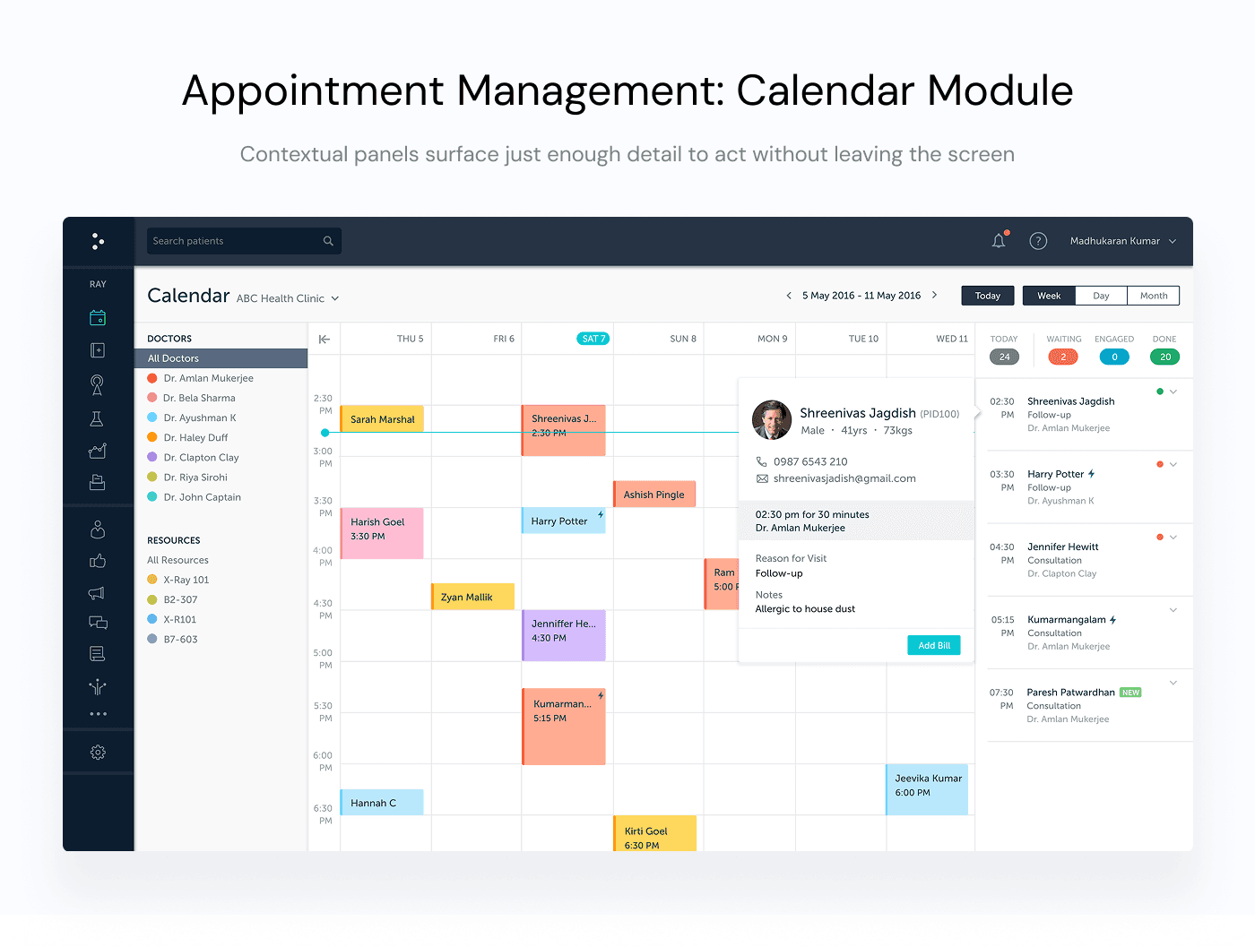
Practo Ray serves doctors, receptionists, and administrators — often at the same time. Each role moves through the same structure, but with different priorities.
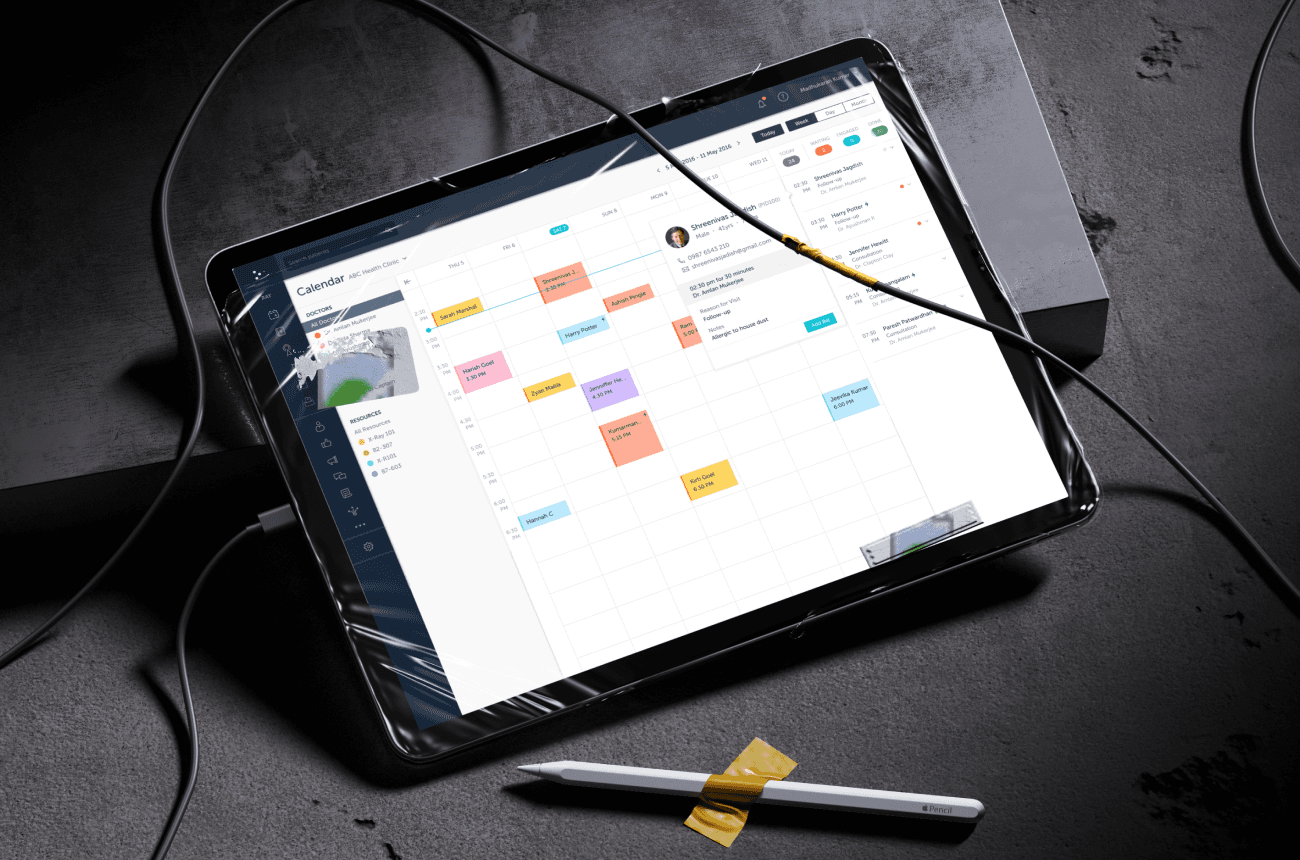
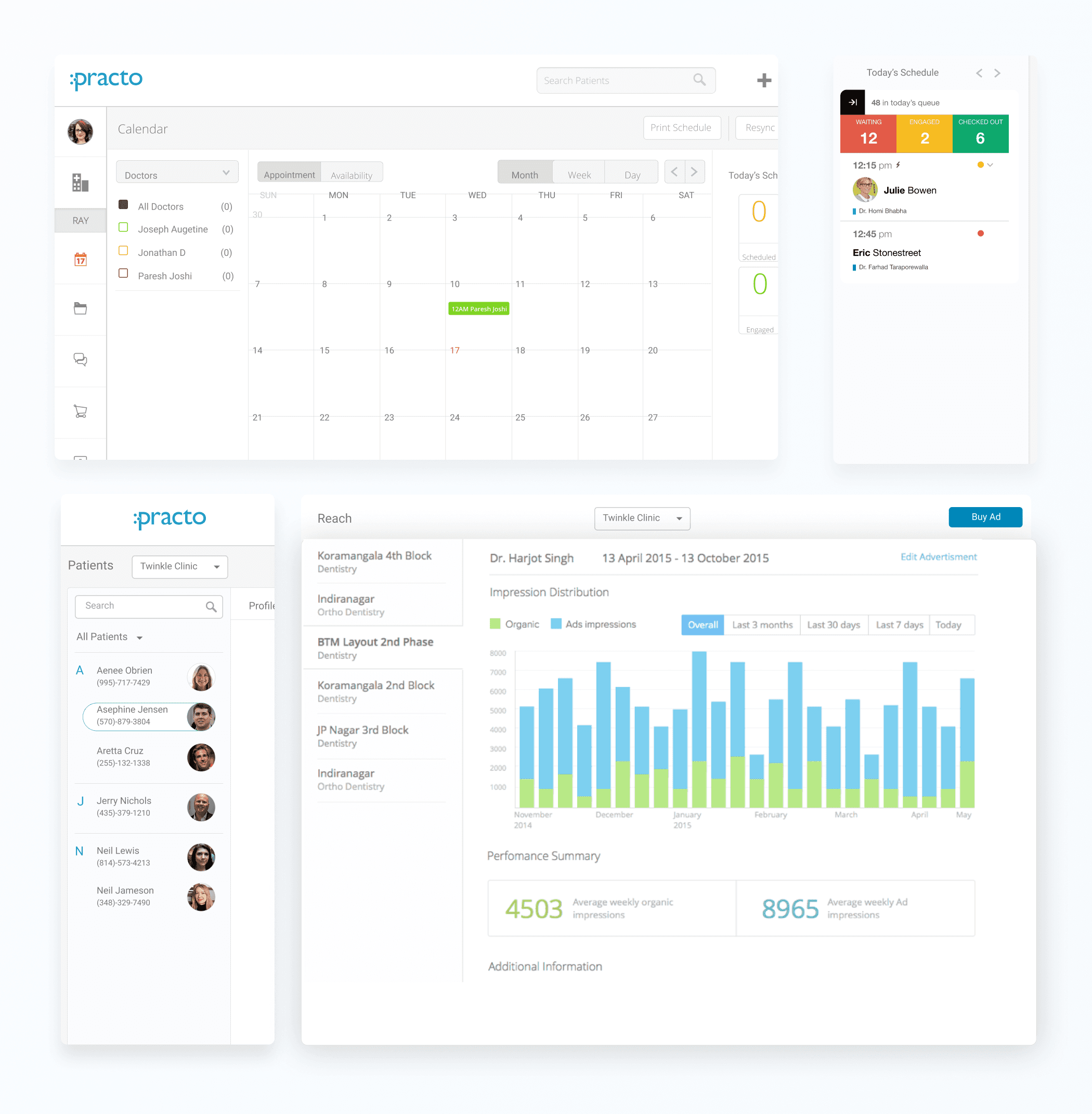
The calendar supports speed and visibility during peak hours, while contextual panels surface just enough detail to act without leaving the screen.
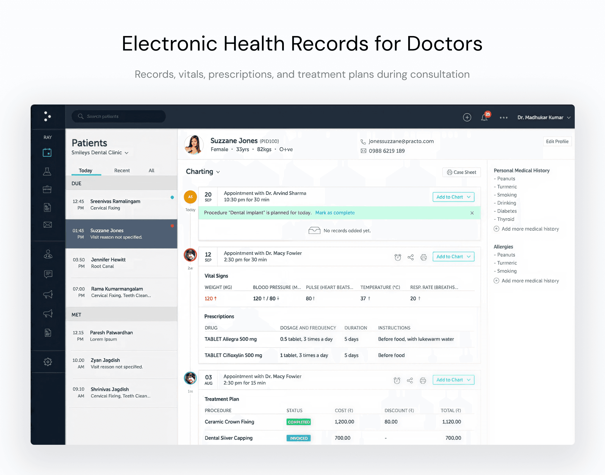
In the patient view, records, vitals, prescriptions, and treatment plans are grouped by relevance rather than chronology. Information is layered, not stacked, allowing continuity during consultations without overwhelming the interface.
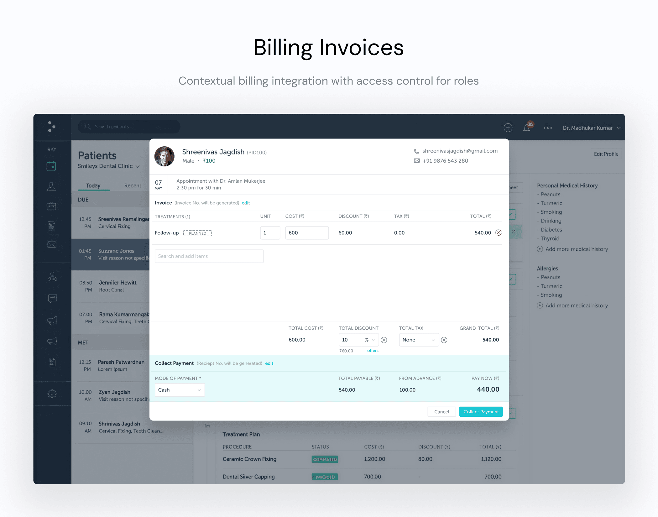
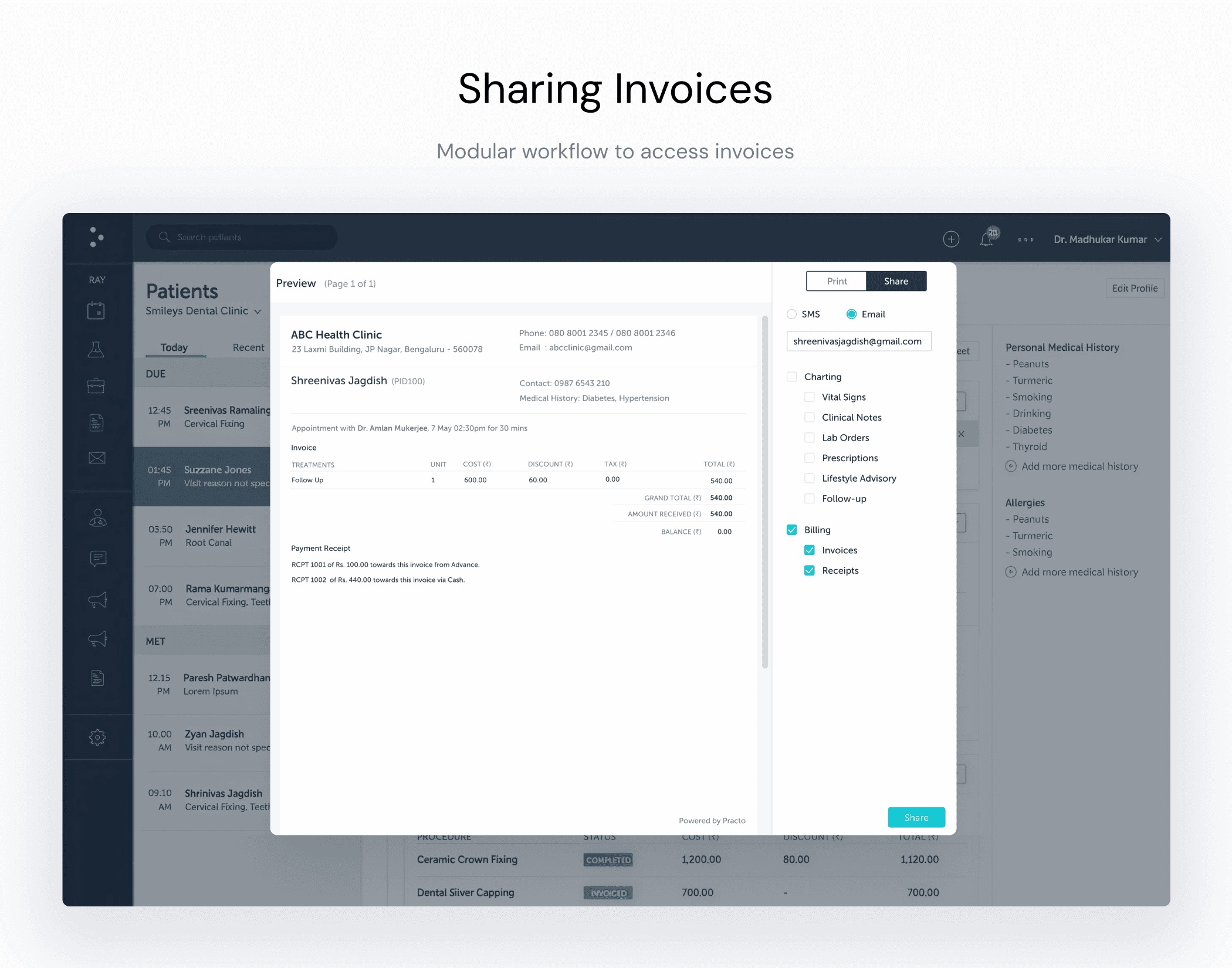
Billing and payment flows are embedded directly into the workflow. From adding treatments to collecting payment and sharing receipts, actions follow a clear sequence. The system supports closure — not just documentation.
Across modules, data density wasn’t removed; it was reorganized. Clear hierarchy, deliberate grouping, and functional color for status and alerts guide attention. Predictability — not visual novelty — became the principle.
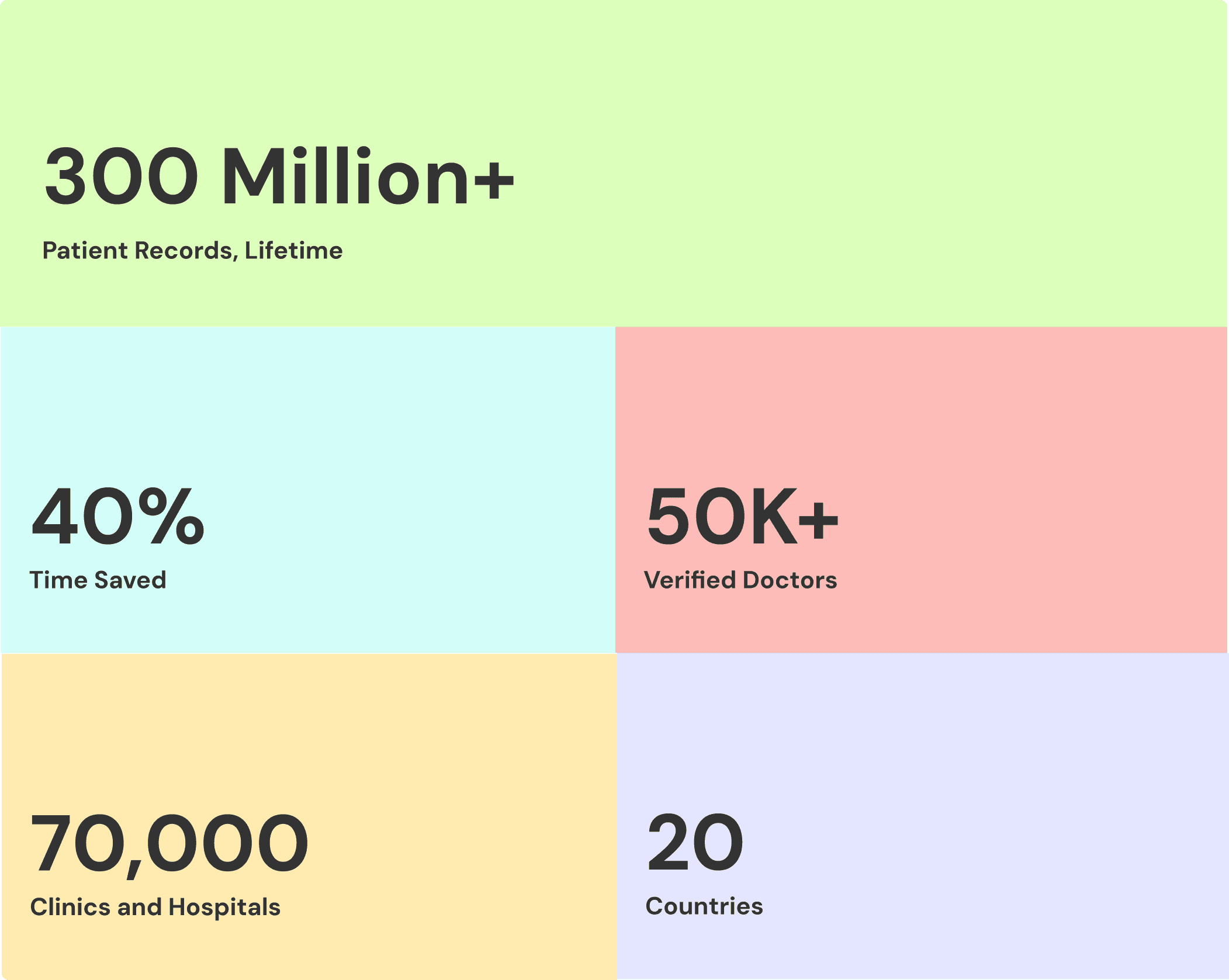
Results
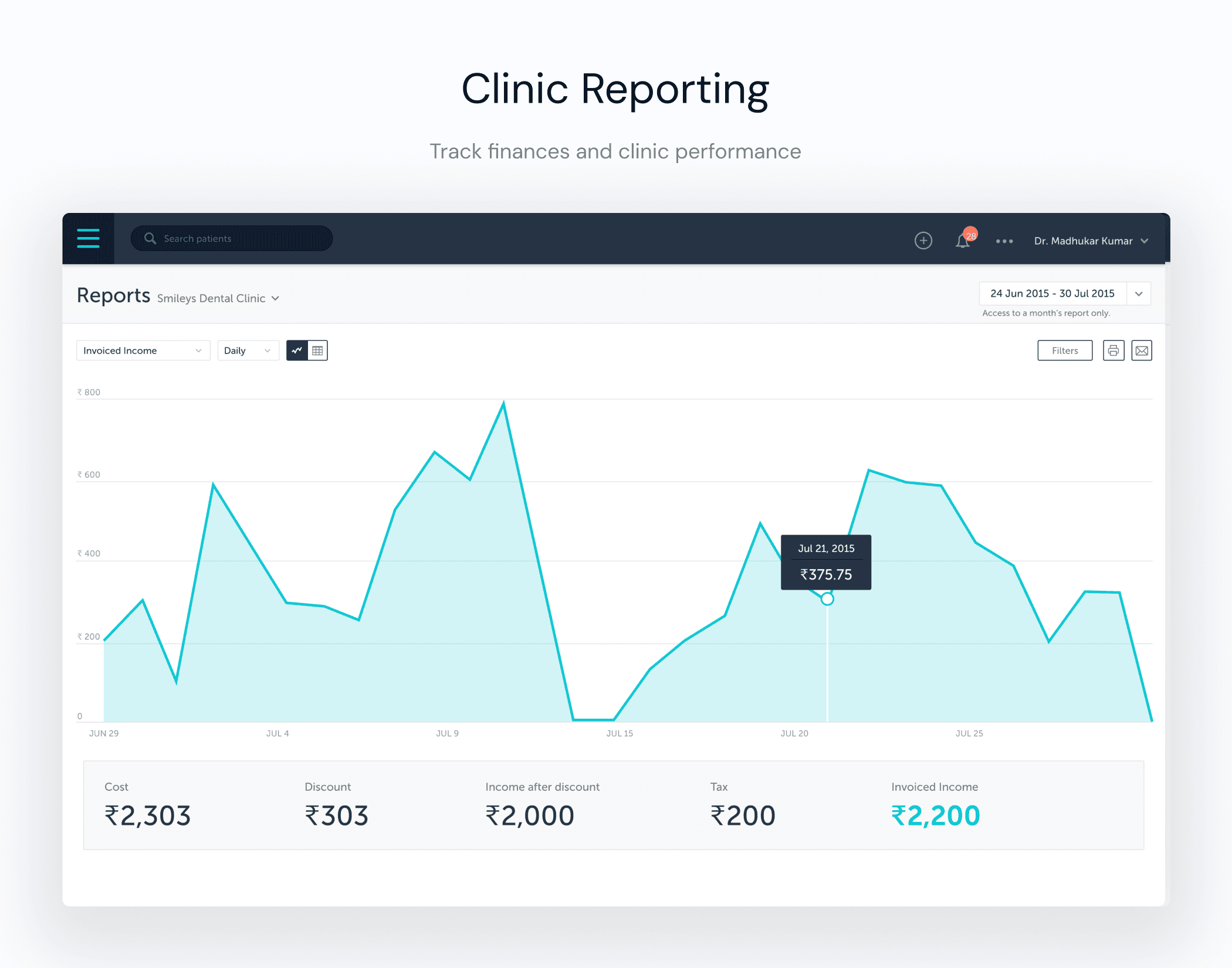
The redesign delivered a 40% improvement in operational efficiency, supporting 300M+ patient records, 50K+ verified doctors, and 70,000+ clinics across 20 countries.
More importantly, the system shifted from high-attention software to low-friction infrastructure. As products scale, complexity is inevitable.

Leadership in design isn’t about making things minimal, it’s about making complexity navigable. This project reinforced a core principle: clarity at scale is a structural decision, not a visual one.